Data-Driven Cities: Air-Break Ferrara's Real-Time Air Quality Insights for Informed Citizens and Policymakers
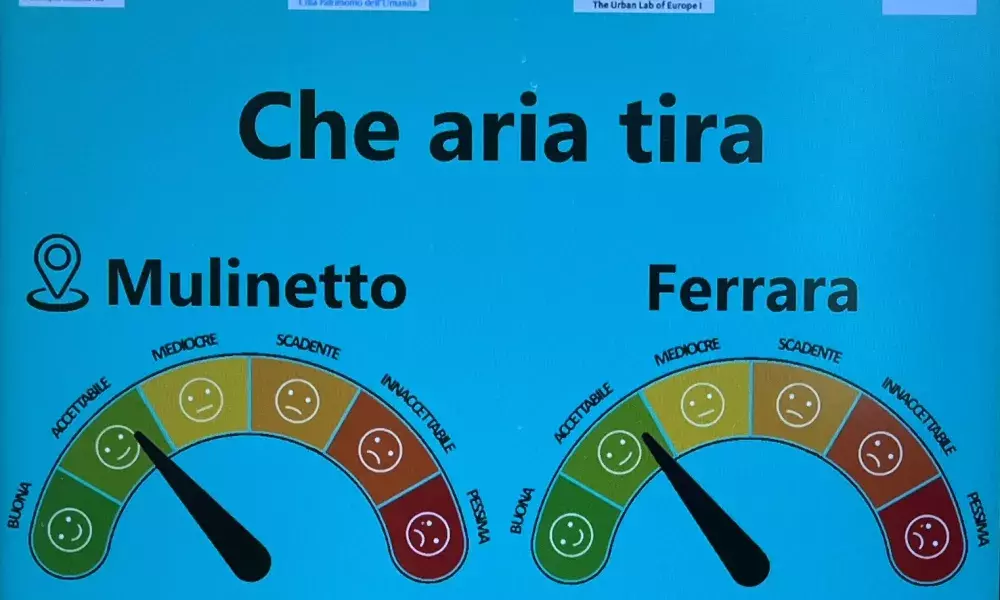
At its core, the data visualization platform developed by Air-Break serves a dual purpose. Firstly, it aims to provide citizens with immediate and comprehensible insights into the air quality of their city. Secondly, it offers a powerful tool for policymakers and city practitioners, equipping them with real-time information to make informed decisions for urban well-being.
The heart of the visualization platform is the "Air-Break Index," a unique air quality value derived for each of the 14 areas where the LSA Units are located (see my Zoom-In Nr. 1 and Journal Nr. 2 for additional details on the project's air quality monitoring system). This dynamic index, aligned with European Environmental Agency standards, is calculated from measurements of various pollutants. It provides a nuanced and immediate understanding of air quality conditions, offering a granular view across the city.
However, the journey to creating an effective air quality index wasn't without its challenges.
Crucially, one of the core challenges revolved around the alignment between official data collected by the Regional Environmental Protection Agency of Emilia Romagna (ARPAE), and the data gathered through the Air-Break Ferrara project's new air-quality monitoring stations (LSA Units). Maintaining consistency and reliability in the information presented on the dashboard was identified as paramount, and it took several months of discussion between the project partners and the environmental authorities to reach an agreement on how to best convey such sensitive information to the public.
The need for simplicity in communication, especially to citizens with varying levels of familiarity with air quality metrics, was a key consideration. Striking the right balance between conveying essential information and avoiding data overload became a central challenge in the design process of the visualisation platform.
To overcome these challenges, Air-Break Ferrara embraced a co-creation approach involving local stakeholders. Representatives from environmental associations, academic institutions, and local authorities actively contributed to shaping the design guidelines and principles. These co-creation workshops, spanning for several months, not only guided the visual representation of data but also emphasized the importance of clear language, user-friendly interpretation, and actionable information.


The fruition of this collaborative effort is prominently visible on the Air-Break Ferrara website. Here, citizens can access real-time updates on the Air-Break Index, presented through interactive components like the Air-Break Quality Meter, navigable maps, and parameter-specific thermometers. This online dashboard becomes a central hub for urban dwellers to stay informed about air quality conditions.


Moreover, recognizing the diverse ways citizens engage with their city, Air-Break Ferrara introduces an innovative approach. Information totems, strategically installed in the new smart bike lanes, cater to cyclists' need for quick, accessible information. These totems, equipped with screens connected to the internet, display simplified charts showcasing the air quality index for each of the 14 areas, providing a granular view of air quality across the city. The background colour, following the EEA legend, provides an immediate visual cue of air quality conditions.

In conclusion, the real-time data visualization platform crafted by Air-Break Ferrara isn't just a technological marvel; it's a testament to the power of collaboration and innovation in urban development. For policymakers and city practitioners, the platform offers a dynamic tool to make decisions that directly impact urban well-being. For citizens, it provides a gateway to understanding their environment and making informed choices that contribute to a healthier, more sustainable city.
As we navigate this landscape of real-time insights, the importance and relevance of Air-Break Ferrara's data visualization become clear. It's not merely about the numbers on a screen; it's about empowering citizens to be active participants in shaping the future of their city. The ripple effects of this initiative extend beyond data points, creating a wave of awareness and informed decision-making that echoes through the streets of Ferrara and sets a standard for data-driven cities across the EU.
About this resource
The Urban Innovative Actions (UIA) is a European Union initiative that provided funding to urban areas across Europe to test new and unproven solutions to urban challenges. The initiative had a total ERDF budget of €372 million for 2014-2020.
Similar content
